


Table of contents:
Introduction.
Risk and model limitations.
Spherical approaches.
K-Means.
K-Medoids.
Hierarchical approaches.
Density-based techniques.
DBSCAN.
OPTICS.
Model-based methods.
Grid-based & spectral methods.
CLIQUE.
Spectral clustering.
Fuzzy clustering.
Neural network-based methods.
Before you begin, remember that you have an index with the newsletter content organized by clicking on “Read the newsletter index” in this image.

Introduction
Alright, let’s establish first principles. Before deploying capital into algorithmic strategies, one must confront the paradigm shift that distinguishes durable firms from those erased by structural blind spots: financial markets are not monolithic stochastic processes but non-stationary systems governed by latent regime dynamics. This is not heuristic philosophy—it’s an empirical reality quantified through decades of regime-dependent risk premia and structural break analysis.
Every junior quant, armed with asymptotic theorems and clean data matrices, begins with the same intellectual shit: the assumption that markets exhibit global ergodicity. You construct elegant factor models—momentum, mean reversion, cointegration—optimized on historical time series under the illusion of stationarity. For a finite horizon, these models perform beautifully, their Sharpe ratios inflated by periods of regime persistence. Your backtests become exercises in overfitting, mistaking coincident stability for invariant truth.
This is the danger of deterministic thinking in a probabilistic domain. Your strategy thrives in a local equilibrium, calibrated to a specific regime’s statistical fingerprints—low realized volatility, persistent auto-correlation, stable cross-asset dependencies. But markets are adaptive systems. The moment regime boundaries shift—triggered by macroeconomic thresholds, liquidity phase transitions, or endogenous feedback loops—your model’s assumptions collapse. A momentum strategy tuned to trending markets withers under mean-reverting volatility spikes; a statistical arbitrage framework predicated on tight spreads disintegrates during liquidity droughts. The mathematics remain valid within the regime, but the system itself has mutated.
The epiphany arrives via PnL volatility: markets are better modeled as a mixture of distributions than a single stochastic process. Regime identification becomes the critical challenge. Formally, a regime is a metastable state characterized by distinct joint probability distributions over asset returns, volatility, correlation matrices, and microstructure signals. These states—think the "Complacent Bull" (low vol, positive drift), "Panicked Bear" (high vol, negative skew), and "Sideways Chop" (structural breakouts failing due to range-bound noise)—exhibit path dependency and memory effects.
Legacy models fail because they ignore regime segmentation, akin to applying linear regression to a piecewise function. The solution lies in unsupervised learning: algorithms that detect regime boundaries without labeled data. We are going to start by something simple like clustering techniques. Features might include realized volatility surfaces, cross-asset correlation eigenvalues, orderbook imbalance metrics, or entropy measures of liquidity concentration.
Clustering isn’t a panacea. It demands rigorous validation via silhouette scores, gap statistics, or out-of-sample stability tests. More critically, it requires domain-specific feature engineering to capture regime-defining characteristics. Seasoned practitioners know that regime detection is inherently recursive: today’s clusters inform tomorrow’s risk models, which refine the features used to identify the next regime shift.
If you are curious, check this:

There are no universal solutions, only frameworks for dynamic adaptation. The algorithms we’ll explore are not tools but lenses: each revealing partial truths about the market’s ever-shifting anatomy. Your survival hinges on switching these lenses faster than the system changes its shape. Let’s begin.
Risk and model limitations
Clustering is an essential technique for exploratory data analysis, allowing us to uncover latent structures in unlabeled data. However, it is crucial to recognize that a clustering algorithm is not an oracle that reveals pre-ordained truths. It is a mathematical procedure that optimizes a specific objective, and its results are highly sensitive to initial assumptions, algorithmic choices, and human interpretation. Understanding its limitations is the key to using it effectively.
The risks can be broadly categorized into three categories:
Foundational risks → Flaws in the premise:
These risks arise before any algorithm is run. They are fundamental to how the problem is framed.
The entire output of a clustering analysis hinges on the definition of "similarity" or "distance." This choice is made based on assumptions. An algorithm has no inherent understanding of context; it simply processes the mathematical representation of the features you provide. Choosing irrelevant or poorly scaled features will lead to mathematically valid but practically meaningless clusters.
As the number of features used to describe each data point increases, the concept of distance becomes less meaningful. In a high-dimensional space, the distance between any two points can appear to be almost equal. This makes it incredibly difficult for algorithms that rely on distance metrics—like K-Means or DBSCAN—to differentiate between a point's "close" and "distant" neighbors. The algorithm may find patterns, but these are often just artifacts of the vast, sparse space, not genuine structures in the data.
Price is not static, it evolves. A clustering model built on data from last year may be a poor representation of the current reality. This "concept drift" means that clusters are not permanent structures but transient states, and models must be regularly re-evaluated and retrained to remain relevant.
Algorithmic risks → Bias of the tools:
Every clustering algorithm has an intrinsic bias regarding the types of structures it is designed to find. Using the wrong tool for the data's underlying geometry is a common mistake.
Different algorithms are biased towards finding clusters of specific shapes. K-Means, for instance, will always try to find spherical, roughly equal-sized clusters because it works by minimizing variance around a central point. If the true clusters in your data are long and thin, or intertwined like crescent moons, K-Means will fail, incorrectly splitting them apart or merging them. DBSCAN can find arbitrary shapes but assumes all meaningful clusters have a similar density, which may not be the case. The algorithm will always return an answer, but that answer will be distorted if the data's true shape doesn't match the algorithm's bias.
Most clustering algorithms require the quant to set crucial parameters beforehand. The most famous is the number of clusters,
K, in K-Means. How do you know the correct number of clusters in advance? While methods exist to guide this choice—like the Elbow method—they are often ambiguous. Other algorithms are sensitive to different parameters, like the neighborhood radius—eps—in DBSCAN. A small change in these initial settings can lead to vastly different clustering outcomes, making the results seem arbitrary and unstable if the parameters cannot be robustly justified.Some algorithms are highly sensitive to outliers or noise. Since methods like K-Means attempt to assign every single point to a cluster, a few extreme outliers can significantly skew the position of a cluster's center, thereby corrupting the entire group. While some algorithms like DBSCAN have an explicit notion of "noise," those that don't can produce misleading results.
Interpretation risks → Fallacies in the conclusion:
Once the algorithm produces an output, the final and most critical set of risks emerges from human interpretation.
A clustering algorithm will always find clusters, even in perfectly random data. The human tendency is to seek patterns and assign narratives to these groupings. Just because you find a cluster and can describe its members' common characteristics does not mean the cluster represents a meaningful, underlying phenomenon. It might simply be a statistical coincidence. Attributing causality or deep significance to a mathematically derived group without external validation is a dangerous leap of faith.
It is easy to create a clustering model that perfectly partitions the data you used to build it. However, the true test of a model is how well it generalizes to new, unseen data. A model that is too complex or too finely tuned to the initial dataset has likely overfit the noise and random quirks present in that sample. When new data arrives, this overfit model will fail to assign it to the correct clusters, making it useless for any predictive or real-time application.
The boundaries between clusters are often fuzzy. A data point near a boundary can be re-assigned to a different cluster if the data is slightly perturbed or the model is re-run. This instability can make it difficult to rely on the classification for any critical downstream task. Furthermore, while we can mathematically describe a cluster by the average values of its features, this does not always translate to a simple, human-understandable concept.
The devil was in the execution. Clustering promised to be our compass, yet its limitations emerged like landmines in the path of progress. Further we will see how to avoid them.

Spherical approaches
My first instinct was to start simple. The most intuitive idea of clustering is simply to partition the data into a pre-specified number of groups, K. This leads us straight to the workhorse of clustering: K-Means.
K-Means
The concept is beautifully straightforward. Imagine you want to group all the trading days from the last five years into three regimes (K=3): "Bullish," "Bearish," and "Neutral." K-Means tries to find the best three central points—called centroids—to represent these regimes.
The algorithm is iterative:
Initialization: First, it randomly places K centroids in your data space. In our case, imagine a 2D plot where the X-axis is the daily return of the S&P 500 and the Y-axis is the daily change in the VIX—volatility index. We'd just plop three points down randomly on this chart.
Assignment step: It goes through every single trading day and assigns it to the nearest centroid. The nearness is typically measured by standard Euclidean distance.
Update step: After assigning all the days, it recalculates the position of each centroid to be the mean—the average—of all the data points assigned to it.
Repeat: It repeats the assignment and update steps until the centroids stop moving, meaning a stable solution has been found.
The objective function that K-Means tries to minimize is the sum of squared distances from each data point xi to its assigned cluster's centroid μj. This is called the within-cluster sum of squares.
Where Cj is the set of all points in cluster j.
Let's simulate some market data. We'll create three distinct regimes:
Positive returns, low volatility change—bull quiet.
Negative returns, high volatility change—bear volatile.
Near-zero returns, moderate volatility change—sideways chop.
import numpy as np
from sklearn.cluster import KMeans
from sklearn.preprocessing import StandardScaler

# Generate synthetic market data
# We create data representing daily (Return, Volatility Change)
np.random.seed(42)
# Regime 1: Bull Quiet
bull_quiet = np.random.randn(100, 2) * [0.5, 0.5] + [1.0, -1.0]
# Regime 2: Bear Volatile
bear_volatile = np.random.randn(100, 2) * [0.6, 0.8] + [-1.2, 3.0]
# Regime 3: Sideways Chop
sideways_chop = np.random.randn(100, 2) * [0.3, 0.7] + [0.1, 0.5]

market_data = np.vstack([bull_quiet, bear_volatile, sideways_chop])

# Preprocessing
# It's crucial to scale data for distance-based algorithms like K-Means
scaler = StandardScaler()
scaled_data = scaler.fit_transform(market_data)

# Apply K-Means
kmeans = KMeans(n_clusters=3, random_state=42, n_init='auto')
clusters = kmeans.fit_predict(scaled_data)
centroids = kmeans.cluster_centers_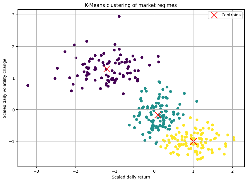
The resulting plot would show our three blobs of data points, each colored differently, with a red 'X' marking the calculated center of each cluster. It looked beatufully artificial! Okay, we had successfully partitioned our market days.
Strengths:
K-Means is computationally efficient, making it suitable for large datasets.
Its logic is intuitive, making it a great starting point.
Pitfalls and our "oh, crap" moment:
The initial success quickly faded when we applied it to more complex data. The pitfalls became glaringly obvious.
We have to specify the number of clusters, K, beforehand. How do we know if there are 3, 4, or 10 market regimes? Choosing the wrong K leads to nonsensical groupings. We can use methods like the "Elbow Method," but often the "elbow" i ambiguous, leaving the choice subjective.
The initial random placement of centroids can lead to different final clusters. Running the algorithm multiple times with different random starts is a must.
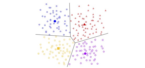
K-Means implicitly assumes that clusters are spherical and evenly sized—this is a killer. Financial data is rarely so well-behaved. What if a "panic" regime is a long, thin, oddly shaped cluster? K-Means would fail spectacularly to capture it. It draws a circle where it should be drawing a snake.
A single extreme outlier event—like news—could drag a centroid way off course, corrupting an entire cluster.
To combat the outlier problem, we briefly experimented with K-Medoids—PAM - Partitioning Around Medoids. Instead of using the mean which is sensitive to outliers as the center, K-Medoids uses a medoid—an actual data point from the cluster—as the center.
K-Medoids
From a methodological standpoint, K-Medoids is a direct and robust alternative to K-Means. The primary limitation of K-Means stems from its use of the centroid—the mean of the points in a cluster—as the cluster prototype. The mean is a statistical measure that is notoriously sensitive to outliers. A single, aberrant data point can significantly skew the centroid, pulling it away from what we would intuitively consider the cluster's "center."
K-Medoids addresses this deficiency by a simple but key change: instead of a centroid, it uses a medoid. A medoid is constrained to be an actual data point from the dataset. It is defined as the point within a cluster that has the minimum average dissimilarity to all other points in that same cluster. By constraining the center to be an existing point, the algorithm becomes substantially more robust to the influence of extreme outliers and noise.
The most common algorithm for K-Medoids is PAM—Partitioning Around Medoids. Its objective is to minimize the sum of dissimilarities between the points and their respective cluster's medoid. However, it is much more computationally expensive and still suffered from the "K" and shape assumption problems. Our simple partitioning approach was too rigid for the fluid, strangely shaped reality of the market.
The algorithmic procedure PAM can be summarized as follows:
Initialization: Select K points from the dataset X to serve as the initial medoids.
Assignment: Assign each data point to the cluster corresponding to the nearest medoid. The total cost is the sum of the distances of all points to their medoid.
Update: For each cluster, consider swapping its medoid with a non-medoid point from the same cluster. Calculate the change in the total cost for each potential swap. If a swap would reduce the total cost, perform the swap that yields the greatest cost reduction.
Iteration: Repeat steps 2 and 3 until the medoids no longer change, indicating that the algorithm has converged to a local minimum.
The objective function of the K-Medoids algorithm is to find the set of medoids M and the corresponding partition C that minimizes the total within-cluster dissimilarity. This is expressed as:
Let's dissect this formula:
The inner summation calculates the sum of distances from every point xj within a single cluster Ci to that cluster's medoid, mi. This value represents the "cost" or total dissimilarity for that specific cluster.
The outer summation sums up the costs of all k individual clusters. The result is the total cost for the entire clustering configuration defined by the set of medoids M.
The minimization indicates that we are searching for the specific set of k medoids, chosen from the original dataset X, that results in the minimum possible value for this total cost function.
In essence, the formula seeks the most centrally located data points to act as exemplars for each cluster, where "centrality" is defined by the minimization of the sum of distances to all other points in that cluster.
Unlike K-Means, which minimizes the sum of squared Euclidean distances to an artificial centroid, the K-Medoids objective function typically uses the sum of absolute distances or other dissimilarity measures. This lack of squaring is a key reason for its increased robustness to outliers, as extreme distances are not amplified quadratically.
Let’s code it:
import numpy as np
from sklearn.cluster import KMeans
from sklearn.metrics import pairwise_distances

# Simplified K-Medoids (PAM) implementation
def kmedoids_simple(X, n_clusters, max_iter=100):
    """
    A simplified implementation of the K-Medoids (PAM) algorithm.

    Args:
        X (np.ndarray): The input data, shape (n_samples, n_features).
        n_clusters (int): The number of clusters (K).
        max_iter (int): The maximum number of iterations.

    Returns:
        tuple: A tuple containing:
            - labels (np.ndarray): Cluster labels for each point.
            - medoid_centers (np.ndarray): The final medoid points.
    """
    # 1. Initialize: Randomly select K data points as the initial medoids.
    n_samples = X.shape[0]
    initial_medoid_indices = np.random.choice(n_samples, n_clusters, replace=False)
    medoids = X[initial_medoid_indices, :]

    # Placeholder for the previous medoids to check for convergence
    old_medoids = np.zeros_like(medoids)

    for i in range(max_iter):
        # 2. Assignment Step: Assign each point to the nearest medoid.
        distances = pairwise_distances(X, medoids, metric='euclidean')
        labels = np.argmin(distances, axis=1)

        # 3. Update Step: For each cluster, find the point that minimizes the
        # sum of distances within that cluster (the new medoid).
        new_medoids = np.zeros_like(medoids)
        for k in range(n_clusters):
            # Get all points belonging to the current cluster
            cluster_points = X[labels == k]

            # If a cluster is empty, which can happen with bad initializations,
            # re-assign a random point to it.
            if len(cluster_points) == 0:
                new_medoids[k, :] = X[np.random.choice(n_samples, 1), :]
                continue

            # Calculate the sum of distances from each point in the cluster
            # to all other points in the same cluster.
            intra_cluster_distances = pairwise_distances(cluster_points, metric='euclidean')
            sum_of_distances = np.sum(intra_cluster_distances, axis=1)

            # The point with the minimum sum of distances is the new medoid.
            new_medoid_index_in_cluster = np.argmin(sum_of_distances)
            new_medoids[k, :] = cluster_points[new_medoid_index_in_cluster, :]

        # Check for convergence: If the medoids have not changed, stop.
        if np.all(new_medoids == medoids):
            break

        medoids = new_medoids

    return labels, medoids


# 1. Generate synthetic data
# This section is identical to your original code.
np.random.seed(42)

# Create three distinct clusters
X1 = np.random.randn(50, 2) + np.array([0, 0])
X2 = np.random.randn(50, 2) + np.array([8, 8])
X3 = np.random.randn(50, 2) + np.array([0, 8])

# Add two significant outliers
outliers = np.array([
    [15, 15],  # Outlier affecting cluster X2
    [-5, 15]   # Outlier affecting cluster X3
])

# Combine into a single dataset
X = np.vstack([X1, X2, X3, outliers])

# 2. Apply clustering algorithms
# K-Means Algorithm (unchanged)
kmeans = KMeans(n_clusters=3, random_state=42, n_init=10)
kmeans_labels = kmeans.fit_predict(X)
kmeans_centers = kmeans.cluster_centers_

# K-Medoids algorithm (using our self-contained function)
kmedoids_labels, kmedoids_centers = kmedoids_simple(X, n_clusters=3)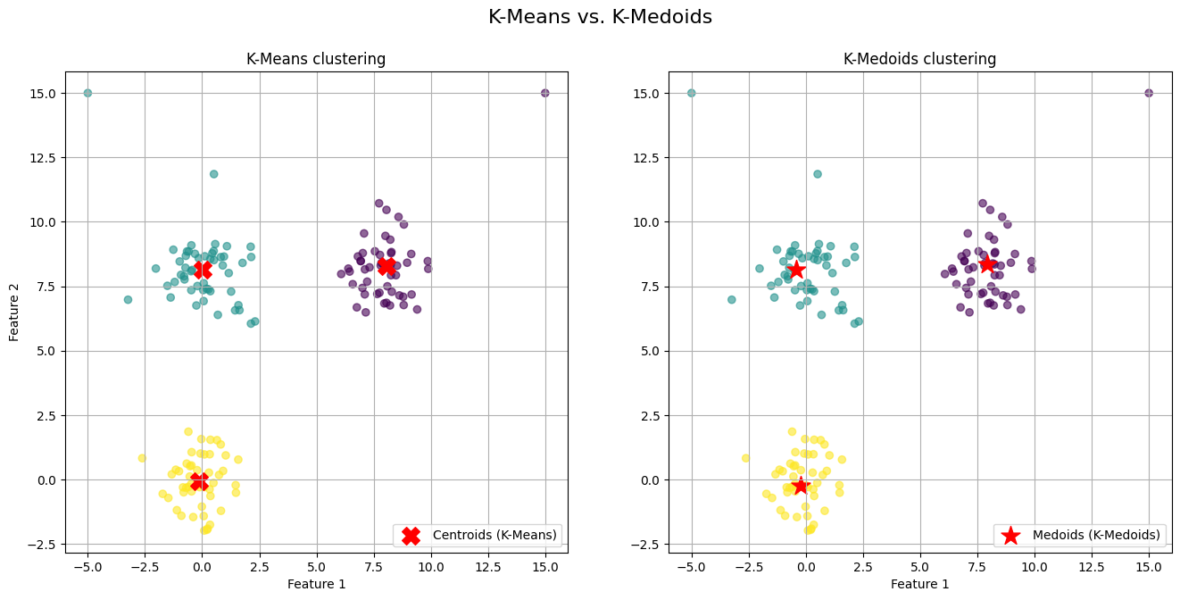
The generated visualization provides a clear and direct comparison of the two algorithms' behaviors.
On the left plot (K-Means) we observe the red 'X' markers representing the centroids. Notice the centroids for the top-right and top-left clusters. They have been noticeably "pulled" away from the dense core of their respective clusters and shifted towards the outliers we introduced. The centroid is no longer a faithful representative of its cluster's central tendency; it is a mathematical average biased by extreme values.
On the right plot (K-Medoids) we observe the red star markers representing the medoids. The medoids for all three clusters are positioned squarely within the dense, central region of their assigned points. Because a medoid must be one of the actual data points, it cannot be an artificial point in space like a centroid. The algorithm selects the most "central" existing point, effectively ignoring the pull of distant outliers.
Now that we know the main strength, but pitfalls continue. It still suffers from the "K" and shape assumption problems.
Hierarchical approaches
Our failure with K-Means leads to a shift in perspective. Maybe market regimes aren't like separate, disconnected islands. Maybe they're related, nested within each other, like a family tree. For instance, a broad high volatility environment could contain sub-regimes like high-vol trend and high-vol chop. This line of thinking leads us to hierarchical clustering.
This method doesn't produce a single flat partition of the data but rather a hierarchy of clusters. There are two main approaches:
Agglomerative (bottom-up): This is the more common approach. It starts with every single data point in its own cluster. Then, in each step, it merges the two closest clusters until only one giant cluster—containing all the data—remains.
Divisive (top-down): It starts with all data points in a single cluster and recursively splits it into smaller clusters.
The real magic of hierarchical clustering is the dendrogram. It's a tree diagram that visualizes the entire hierarchy of merges—or splits. You can then "cut" the dendrogram at a certain height to get a specific number of clusters, but its real power is in showing the relationships.
The key component is the linkage criterion, which defines how to measure the distance between two clusters (not just two points). Common linkage criteria include:
Single linkage: Distance is the minimum distance between any two points in the two clusters. It can find long, thin clusters but is sensitive to noise.
\(d_{\text{single}}(C_A, C_B) = \min_{a \in C_A, b \in C_B} d(a, b)\)Complete linkage: Distance is the maximum distance between any two points. It produces more compact clusters.
\(d_{\text{complete}}(C_A, C_B) = \max_{a \in C_A, b \in C_B} d(a, b)\)Average linkage: Distance is the average distance between all pairs of points. It's a balance between the two.
\(d_{\text{average}}(C_A, C_B) = \frac{1}{|C_A| \cdot |C_B|} \sum_{a \in C_A} \sum_{b \in C_B} d(a, b)\)Ward's linkage: This is often the default. It merges the two clusters that result in the minimum increase in the total within-cluster variance.
\(\text{WCSS}(C_k) = \sum_{\boldsymbol{x}_i \in C_k} \|\boldsymbol{x}_i - \boldsymbol{\mu}_k\|^2\)
Besides the choice of the distance function d(⋅,⋅) is a critical modeling decision:
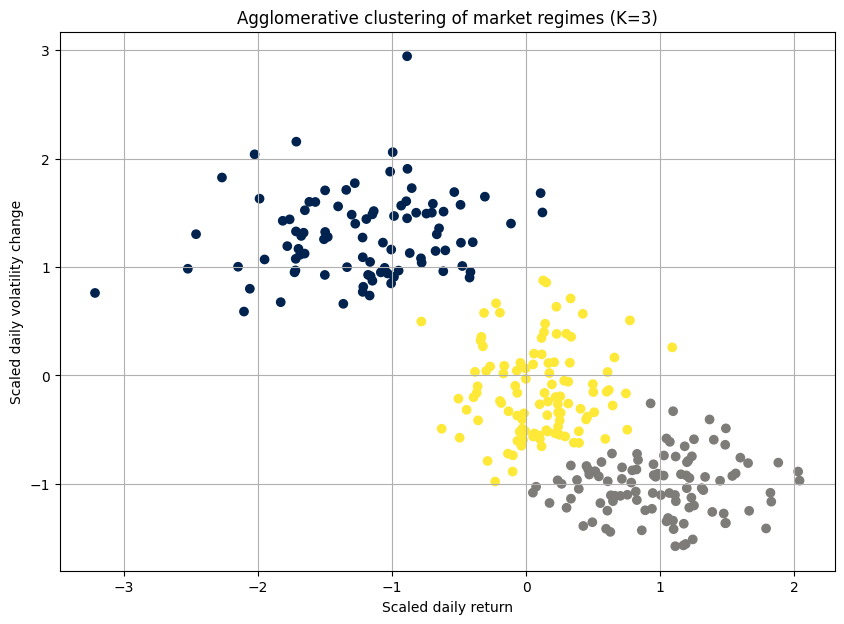
Let's apply this to the same market data:
import scipy.cluster.hierarchy as sch
from sklearn.cluster import AgglomerativeClustering

# Using Ward's linkage method
dendrogram = sch.dendrogram(sch.linkage(scaled_data, method='ward'))

# Perform agglomerative clustering
# Based on the dendrogram, we choose 3 clusters
agg_cluster = AgglomerativeClustering(n_clusters=3, metric='euclidean', linkage='ward')
clusters = agg_cluster.fit_predict(scaled_data)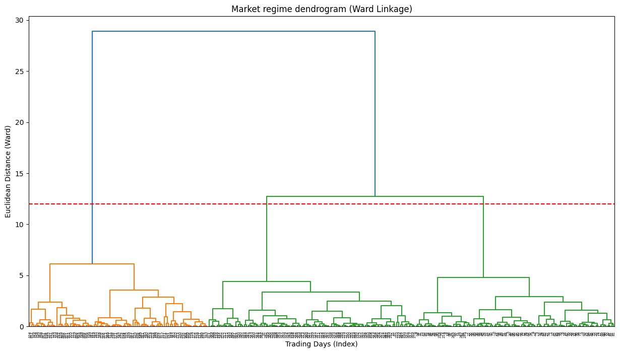
The dendrogram is the key output here. It's a beautiful, complex tree. The y-axis represents the distance at which clusters were merged. By drawing a horizontal line, we can select a number of clusters. For example, where our red dashed line cuts the tree, it crosses three vertical lines, suggesting that three is a reasonable number of clusters.
Strengths:
The number of clusters is not required beforehand. The dendrogram provides a rich visualization of possibilities.
It doesn't just partition; it shows how clusters relate to one another, which can be very insightful for understanding market dynamics.
It can work with any distance metric, not just Euclidean.
Pitfalls and a new frustrations:
Hierarchical clustering felt like a more honest approach. But it wasn't a silver bullet.
The basic agglomerative algorithm has a time complexity of at least O(N2logN), where N is the number of data points. For our dataset of thousands of trading days, it was slow.
While we don't have to specify K upfront, we still have to decide where to "cut" the dendrogram. This decision remains subjective and can dramatically change the interpretation.
Once a merge—in agglomerative—or a split—in divisive—is made, it's final. An early mistake can't be corrected later in the process.
For a high-dimensional dataset, the 2D representation of the dendrogram can be misleading. The distances it portrays might not capture the true, complex relationships in the data.
I have found a way to map the market's family tree, but the map was hard to read and computationally expensive to draw.
Density-based techniques
Until here we have been guided by a core assumption: everything must belong to a cluster:
K-Means forces every day into a regime. Hierarchical clustering assigns every day a place in the family tree. But what if that was wrong? What if some days aren't part of any regime? What if they are just... noise? Outliers? One-off events?
This leads us to a perspective shift, embodied by DBSCAN—Density-Based Spatial Clustering of Applications with Noise.
DBSCAN's philosophy is pretty interesting. It doesn't partition the entire dataset. Instead, it finds dense regions of data points and calls them clusters. Anything in a low-density region is classified as noise or an outlier. This was immediately appealing. We could use it to separate normal market behavior from anomalous crisis days.
DBSCAN has a simple, elegant logic based on two parameters:
eps(ϵ): A radius. This defines the neighborhood around a data point.min_samples: The minimum number of data points required to be within a point'sepsneighborhood for it to be considered a core point.
The algorithm works as follows:
Initialization: It picks an arbitrary starting point.
Assignment step: If this point is a core point—it has at least
min_samplesneighbors within radiuseps—it starts a new cluster. It then recursively finds all density-connected points —other core points or points on the edge of the cluster—and adds them to this cluster.Update step: If the starting point is not a core point, it's temporarily labeled as noise. It might be picked up later as an "edge" point of another cluster.
Repeat: It continues this process until all points have been visited.
A point p is a core point if its ϵ-neighborhood, Nϵ(p), contains at least min_samples points.
Where:
A point q is directly reachable from p if q∈Nϵϵ(p) and p is a core point. This chain of reachability defines the clusters.
Let's create a dataset where the clusters are weirdly shaped and include some random noise points, something K-Means would fail at.
import numpy as np
from sklearn.cluster import DBSCAN
from sklearn.datasets import make_moons

# Generate synthetic data
# make_moons creates a dataset that K-Means would fail on. We would avoid market data for the sake fo this example.
moons_data, y = make_moons(n_samples=200, noise=0.05, random_state=42)
# Add some random noise points
noise = np.random.rand(50, 2) * [4, 2] + [-1.5, -0.5]
complex_data = np.vstack([moons_data, noise])
scaled_complex_data = StandardScaler().fit_transform(complex_data)

# Apply DBSCAN
# These parameters need tuning.
dbscan = DBSCAN(eps=0.3, min_samples=5)
clusters = dbscan.fit_predict(scaled_complex_data)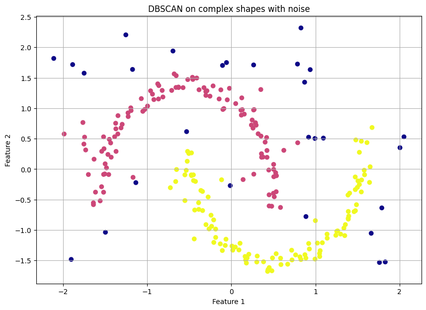
The resulting plot is a revelation. DBSCAN perfectly identifies the two crescent moon shapes as distinct clusters—e.g., in yellow and purple—and correctly labels all the scattered random points as noise—e.g., in dark blue, label -1. This is something neither K-Means nor Hierarchical clustering could have done.
Strengths:
The algorithm finds the number of clusters on its own.
It is not limited to spherical clusters. It can find complex, non-linear shapes.
It has a built-in framework for classifying noise.
Pitfalls and the tuning nightmare:
DBSCAN felt like a massive leap forward. We could finally isolate true anomalies. But it introduced its own set of problems.
The performance of DBSCAN is critically dependent on the choice of
epsandmin_samples. A slightly wrongepscould result in one giant cluster or no clusters at all. Tuning these parameters for high-dimensional financial data was a dark art.DBSCAN assumes that all meaningful clusters have a similar density. It struggles if market regimes have different densities. For example, a panic regime might be extremely dense—many days with similar crash-like behavior—while a low-volatility drift might be very sparse. DBSCAN would find the panic but might label the drift as noise.
To address the varying density issue, we looked at its successor, OPTICS (Ordering Points To Identify the Clustering Structure).
OPTICS
If DBSCAN asks the question: Is this region dense for a specific radius eps? then OPTICS asks the far more profound question: What is the density structure of the data across all possible radii?
OPTICS's philosophy is a masterstroke of generalization. It recognizes that density is not a universal constant but a local property. Instead of producing discrete cluster labels directly, it produces an ordered list of points based on their density relationships. This ordering contains all the information needed to extract clusters for any eps you might have chosen, without having to re-run the algorithm.
To achieve this, OPTICS introduces two new, crucial concepts:
Core distance: For a given
min_samples, the core distance of a pointpis the distance to itsmin_samples-th nearest neighbor. If the point doesn't havemin_samplesneighbors, its core distance is undefined. This is the minimum radiusepsthat would make pointpa core point:\(\text{core_dist}(p) = \text{distance to the min_samples-th neighbor in } N_{\text{min_samples}}(p) \)Reachability distance: The reachability distance of a point
qwith respect to another pointpis the actual distance between them, but no smaller than the core distance ofp. Formally:\(\text{reachability_dist}(q, p) = \max(\text{core_dist}(p), \text{dist}(p, q))\)This is the key insight. It smooths out the density landscape. Points within a dense cluster will have low reachability distances, while points in sparse regions will have high ones.
The algorithm explores the data, always moving to the point with the lowest reachability distance from the set of points it has already processed, creating an ordered traversal of the dataset.
The primary output is not a scatter plot of colored clusters, but a reachability plot. This plot is the signature of OPTICS.
The x-axis is the ordered sequence of points generated by the algorithm.
The y-axis is the reachability distance for each point in that sequence.
You read this plot like a topographical map of density. Valleys represent dense clusters. The points at the bottom of a valley are the core points of a dense region, and they all have low reachability distances to one another. Peaks represent sparse areas or noise. A point with a high reachability distance is far from its neighbors. The depth and width of the valleys tell you about the density and size of the clusters.
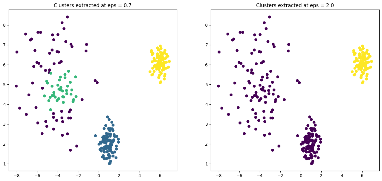
Let's generate a dataset that would fool DBSCAN—one with clusters of varying densities. Then we'll see how OPTICS handles it.
import numpy as np
import matplotlib.pyplot as plt
from sklearn.cluster import OPTICS, cluster_optics_dbscan
from sklearn.datasets import make_blobs

# 1. Generate synthetic data with varying densities
# We create three blobs, two dense and one sparse.
np.random.seed(42)
# A dense cluster
X1, y1 = make_blobs(n_samples=100, centers=[[1, 2]], cluster_std=0.5)
# Another dense cluster
X2, y2 = make_blobs(n_samples=100, centers=[[6, 6]], cluster_std=0.4)
# A much sparser cluster
X3, y3 = make_blobs(n_samples=100, centers=[[-4, 5]], cluster_std=1.5)

X = np.vstack((X1, X2, X3))

# 2. Apply OPTICS
# We only need to set min_samples. OPTICS will figure out the rest.
# xi is a parameter to help with cluster extraction, determining steepness.
optics = OPTICS(min_samples=9, xi=0.05, min_cluster_size=0.1)
optics.fit(X)

# 3. Extract clusters
# We can now extract DBSCAN-like clusters from the OPTICS output
# for a given 'eps'. Let's try two different values to see the effect.

# A smaller eps might only find the densest clusters
labels1 = cluster_optics_dbscan(
    reachability=optics.reachability_,
    core_distances=optics.core_distances_,
    ordering=optics.ordering_,
    eps=0.7  # Smaller radius
)

# A larger eps can find the sparse clusters too
labels2 = cluster_optics_dbscan(
    reachability=optics.reachability_,
    core_distances=optics.core_distances_,
    ordering=optics.ordering_,
    eps=2.0 # Larger radius)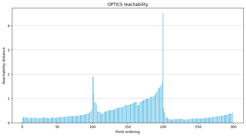
The reachability plot is the crucial output. You can clearly see three distinct valleys, two of which are much deeper (lower reachability distance) than the third, corresponding perfectly to our two dense and one sparse cluster.
The subsequent scatter plots demonstrate the power of this approach. By setting a low eps (0.7), we extract only the two very dense clusters. By increasing eps to 2.0, we capture all three clusters. We did this without re-running the core algorithm, merely by post-processing its rich output.
Strengths:
It can identify clusters of different densities in a single run.
You no longer need to guess a global
eps. The reachability plot provides a multi-scale view of the cluster structure.It is still robust to outliers—which appear as peaks in the plot—and can find clusters of arbitrary shape.
Only one pitfall?
It doesn't eliminate all parameters. The choice of min_samples is still fundamental and has a significant effect on the output. It defines the scale of density you are looking for.
Model-based methods
Up to this point, our clustering methods provided hard assignments. A trading day was either in Cluster A or Cluster B. This black-and-white view felt unnatural. Markets are driven by probabilities, not certainties. A given day might have characteristics of both a trending and a reverting market.
This need to embrace ambiguity leads us to model-based clustering, specifically Gaussian Mixture Models.
A GMM assumes that the data points are generated from a mixture of a finite number of Gaussian distributions—bell curves—with unknown parameters. In our context, each Gaussian distribution represents a market regime. Unlike K-Means, which assigns a point to a single cluster, GMM provides a probability that a point belongs to each of the clusters.
Instead of finding centroids, GMM tries to find the parameters of the Gaussian distributions that best explain the data. For each cluster, it estimates:
Mean (μ): The center of the cluster.
Covariance (Σ): The shape of the cluster. This is a huge advantage over K-Means. A covariance matrix can describe clusters that are elliptical and rotated, not just spherical.
Mixing coefficient (π): The weight or prior probability of that cluster.
The algorithm typically used to fit these parameters is the Expectation-Maximization algorithm:
Initialization: Initialize the means, covariances, and mixing coefficients—e.g., using the output of K-Means.
Expectation step: For each data point, calculate the probability that it was generated by each of the Gaussian components. This is the soft assignment.
Maximization step: Update the parameters (μ, Σ, π) for each component using the probabilities calculated in the expectation step.
Repeat: Iterate the E and M steps until the model's likelihood of explaining the data converges.
The probability density of a data point x is given by a sum over the K components:
where N(x∣μk,Σk) is the Gaussian probability density function for cluster k.
Let's see how GMM handles elongated, non-spherical clusters that would fool K-Means:
import numpy as np
from sklearn.mixture import GaussianMixture
from matplotlib.patches import Ellipse

# Generate elongated, rotated data
# This section is identical to your original code.
np.random.seed(42)
C1 = np.array([[0.0, -0.7], [3.5, 0.7]])
X1 = np.dot(np.random.randn(100, 2), C1)
X2 = np.dot(np.random.randn(100, 2), np.random.randn(2, 2)) + [5, 5]
gmm_data = np.vstack([X1, X2])

# Apply Gaussian mixture model
# This section is identical to your original code.
gmm = GaussianMixture(n_components=2, random_state=42)
gmm.fit(gmm_data)
clusters = gmm.predict(gmm_data)
# Get the probabilistic assignments
probs = gmm.predict_proba(gmm_data)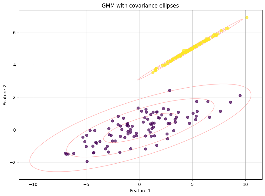
The plot is pretty cool righ!? Not only are the points colored by their most likely cluster, but the red ellipses show the shape and orientation of the Gaussian distributions the model has learned. This visualizes the non-spherical nature of the clusters. The printed output would show, for example, that point 1 belongs to cluster 0 with 98% probability and cluster 1 with 2% probability—a much richer output than a simple "0".
Strengths:
The use of covariance matrices allows GMM to fit a wide variety of elliptical shapes.
Probabilistic assignments are more realistic for financial data and excellent for risk management. We could, for example, reduce trade size when the model is uncertain—e.g., a 55%/45% split.
Pitfalls and the risk of overfitting:
GMM felt like a panacea but its flexibility is a double-edged sword.
If a Gaussian component collapses onto a few data points, its covariance can become zero, leading to an infinite likelihood. This requires regularization or careful initialization.
The EM algorithm is iterative and can be slow, especially with many components or high-dimensional data.
The core assumption is that regimes are Gaussian-shaped. While more flexible than spheres, what if a regime has a fat tail or is bi-modal? GMM would struggle to model this, potentially underestimating extreme risks.
With enough components, a GMM can perfectly fit almost any dataset, essentially memorizing the data rather than finding true underlying structure. The BIC helps, but the risk of finding phantom clusters is high.
We have a model that could embrace uncertainty, but it also had the power to create a beautifully complex and utterly false picture of the market if we weren't extremely careful.