

[WITH CODE] RiskOps: Improving MAE/MFE
A methodical approach to trading with peaks, valleys, and robust models

Table of contents:
Introduction.
The problem with MAE/MFE.
An alternative to finding the optimal target value.
Step 1 - Identify peaks and bottoms.
Step 2: Calculate differences.
Step 3 - RANSAC
The exit strategy based on partial exists.
Before you begin, remember that you have an index with the newsletter content organized by clicking on “Read full story” in this image.

Introduction
Once upon a time, in the enchanted land of Data Science, there existed two popular wizards: Maximum Adverse Excursion and Maximum Favorable Excursion. These magical tools helped traders and engineers measure the extreme ups and downs of their trades. Think of them as the superhero gadgets of financial risk management—capable of measuring how far a price could fall—or rise—during a trade. But alas, like picky eaters who only relish a specific flavor, MAE and MFE insist that all data must be normal, resembling a perfect bell curve.
Imagine you’re measuring the heights of children in a class, and suddenly one kid shows up on stilts! The bell curve gets all confused, and our MAE/MFE tools cry, this isn’t normal! Abort mission! And so, our adventure begins: How do we deal with data that is more like a squashed cupcake or a rollercoaster ride than a neat, bell-shaped curve?

The problem with MAE/MFE
MAE and MFE have long been the darlings of traders who assume that price movements follow a bell-shaped normal distribution. In mathematical terms, when we say a variable X is normally distributed, we mean its probability density function is given by
where μ is the mean and σ is the standard deviation. This formula looks elegant and symmetric, much like a well-baked cake.
However, market data is messy. Prices can be influenced by countless unpredictable factors, leading to distributions that are skewed and heavy-tailed. Under these conditions, MAE and MFE—tools that rely on the assumption of normality— give misleading signals.
Let’s examine the MAE. For a trade, we define:
where Ppeak is a local maximum—a peak—and Ptrought is the subsequent local minimum—a valley.
Under the assumption of normality, we expect the differences Ppeak−Ptrought to be symmetrically distributed about a central value. But when the data is non-normal, extreme values—outliers—may distort this picture, making MAE and MFE unreliable.
Thus, we require an approach that does not rely on the data being normal—a method that can handle irregularities with the grace of a superhero dodging meteors.
An alternative to finding the optimal target value
To tackle the problem of non-normal data, we propose an approach that is both intuitive and mathematically robust. Our method consists of three key steps:
Step 1 - Identify peaks and bottoms:
Imagine you’re hiking in the mountains: the peaks represent the highest points, and the valleys are the lowest dips. In our mathematical frame, peaks correspond to local maxima and valleys to local minima.
A peak is identified when the derivative—the slope—of the function changes sign from positive to negative. Mathematically, if f(x) is our function, then a point x=x0 is a local maximum or peak if:
Similarly, a valley is found when:
This is like saying: If the hill stops rising and starts falling, you’re at a peak! And if it stops falling and starts rising, you’re at a valley! Pretty neat, right?
Let’s see how we can implement this idea. Consider the following code fragment, keeping in mind that it is only used to label or to use as a basis as an approximation for this type of methods, never to give input or output signals:
import numpy as np
import matplotlib.pyplot as plt
from scipy.signal import find_peaks

# Simulate stock price data
np.random.seed(42)
time = np.arange(50)  # Time steps
stock_price = np.cumsum(np.random.randn(50)) + 100  # Random walk around 100

# Find peaks (local maxima)
peaks, _ = find_peaks(stock_price)

# Find bottoms (local minima)
bottoms, _ = find_peaks(-stock_price)

# Plot the stock price with peaks and bottoms
plt.figure(figsize=(10, 5))
plt.plot(time, stock_price, label="Stock Price", linestyle="-", marker="o", markersize=4)
plt.scatter(time[peaks], stock_price[peaks], color="red", label="Peaks", zorder=3)
plt.scatter(time[bottoms], stock_price[bottoms], color="blue", label="Bottoms", zorder=3)
plt.xlabel("Time")
plt.ylabel("Stock Price")
plt.title("Simulated Stock Price with Peaks and Bottoms")
plt.legend()
plt.grid()

# Show the chart
plt.show()
The find_peaks function locates positions in the data array where a peak occurs. To find valleys, we simply invert the data—multiply by -1—and then find the peaks of this inverted series.

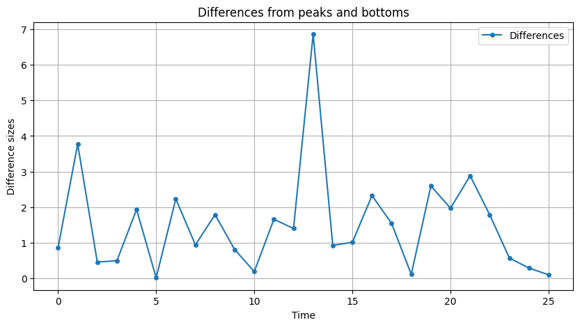
Step 2: Calculate differences:
After identifying our peaks and valleys, the next logical step is to measure the height differences between them. These differences are crucial—they represent the excursion lengths, akin to the difference between the highest mountain and the deepest valley.
In simple math, suppose we have a sequence of peaks P1,P2,…,Pn and valleys B1,B2,…,Bn. The difference between a peak and the following valley is given by:
and for valleys followed by the next peak, we can write:
These differences help us quantify the magnitude of fluctuations in our data. We can now calculate the differences as follows:
# Assuming 'stock_price' is our array and 'peaks' and 'bottoms' are identified indices
differences = []

# We take the difference between each peak and the subsequent valley.
# (This is a simplified illustration; in practice, one must align peaks and valleys correctly)
for p, b in zip(peaks, bottoms):
    differences.append(stock_price[p] - stock_price[b])
For each pair, we subtract the valley’s value from the peak’s value and if you plot this:
Step 3 - RANSAC:
Now comes the part where a robust algorithm called RANSAC or Random Sample Consensus combined with quantile analysis to deal with data chaos.
RANSAC is a powerful method that fits a model to data while ignoring outliers. Imagine a robot that randomly picks points, draws a line through them, and then checks which points are in line—inliers. It repeats this process until it finds the best line that fits the majority of the data.
Mathematically, RANSAC minimizes the loss function:
where m and b are the slope and intercept of the line, respectively. The goal is to find the line that best represents the normal behavior of the data, ignoring the extreme outliers.
After applying RANSAC, we further analyze the distribution of our differences by computing quantiles.
Suppose X is a random variable with cumulative distribution function F(x)=Pr(X≤x). Then, for any probability level p∈[0,1], the p-th quantile Qp is defined as:
Where:
F(x) tells us the probability that X takes on a value less than or equal to x.
The set {x:F(x)≥p} consists of all values x for which the probability of X≤x is at least p.
The infimum of that set is the smallest such value, making it the p-th quantile.
For example:
Q0.90 = inf{x:F(x)≥0.9} is the 90th quantile.
Q0.10 is the 10th quantile, etc.
Because quantiles are non-parametric, they don't assume any specific underlying distribution shape—like the normal distribution. This makes them especially valuable for analyzing data that has been pre-filtered by RANSAC, ensuring that our analysis remains robust even in the presence of outliers.
Here, everyone should choose their stoploss and take profit based on their strategy, but I was talking about it the other day with a fellow:
if your strategy doesn't work well from the start, something is wrong and it is better for the system to close with a small loss and to look for alpha elsewhere.
Alternatively, you can choose multiple quantiles to have multiple targets. Let's see the whole example: